
The 2026 Colors of the Year (And How We’re Incorporating Them in Home Design)
Every major brand has spoken. Here's what we actually think, and how to use it.
Every year, paint brands announce their Colors of the Year with the kind of ceremony usually reserved for award shows.
Trend reports drop.
Design media scrambles to analyze the choices.
And our clients ask us the same question: what does this actually mean for my home?
We've reviewed all of them.
This year, more than a dozen brands weighed in: from the predictable to the genuinely surprising, and there is a clear story being told across the collective. A return to warmth. A move toward depth. An industry-wide signal that the cool, gray, minimal era is not just fading but over.
Here is our complete editorial take on every Color of the Year for 2026, what each brand is communicating, and most importantly, how to use these colors in a luxury residential context.
Because a paint color announcement is only the beginning of the conversation.
A Color of the Year isn't a mandate. It's a direction. Our job is to tell you whether that direction is right for your home.
The 2026 Colors of the Year tell a coherent story: warmth, depth, and a decisive shift away from cool neutrals.
WHAT 2026 IS SAYING: THE COLLECTIVE STORY
Before we get to individual brands, the macro view: this year's Colors of the Year are the clearest industry signal we've seen in years that the market has decisively moved.
The cool gray palette that dominated residential interiors for the better part of a decade is being replaced, not slowly, but confidently by warmth.
Warm whites. Earthy neutrals. Deep botanical greens. Rich aubergine. Toasted browns and honeys. The brands that are leaning into this direction are making smart, enduring choices. The few that are holding onto cooler tones are reading as out of step.
The other through-line: comfort and sanctuary. Many of these colors speak to an audience that wants their home to feel like a retreat, enveloping, intimate, and genuinely restorative. After years of interiors that prioritized visual minimalism above all else, the market has swung toward richness.
Here's how we see each brand's selection, and what it means in practice.
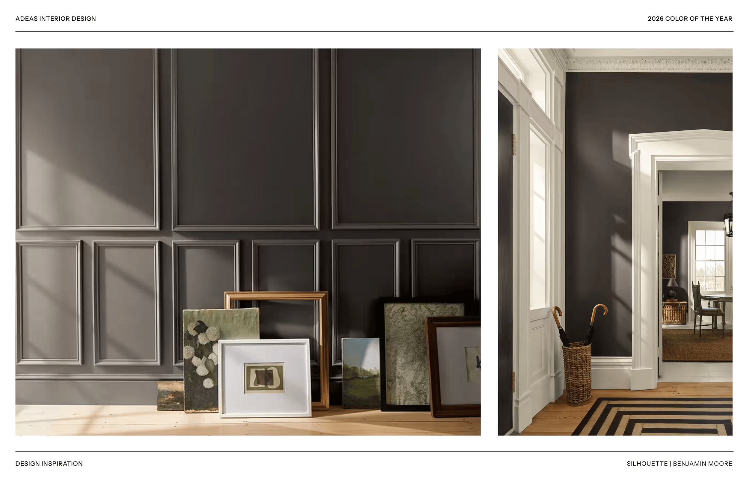
BENJAMIN MOORE Silhouette
A warm, sophisticated gray-brown that leans earthy without going full brown. This is Benjamin Moore at their most confident, a color that works as a true neutral but has genuine warmth and weight to it. It weaves a narrative of refined style and grace into any palette of enchanting pales and handsome mid tones. It pairs beautifully with natural wood, unlacquered brass, and rich textiles. This is not a trend color. It is a foundational one.
Use it for: Living rooms, primary suites, home offices, and any space where you want warmth without committing to a saturated color. Works exceptionally well with white oak floors and linen upholstery.
Skip it if: Your furnishings and materials run cool, this color will fight against blue-gray or stark white in the same space. Pair it intentionally.

DUNN-EDWARDS Midnight Garden
A deep, sophisticated botanical green with enough blue to feel cool and calming rather than warm and earthy. This is a statement color, not a neutral, and it should be used accordingly. In the right application, it is extraordinary: rich, layered, with a quality that changes completely in different light conditions.
Use it for: Dining rooms, powder baths, home libraries, and primary suite accent walls. This is a color for a room you want to feel like an experience.
Skip it if: You want warmth. This color runs decidedly cool. It's stunning in the right context but creates distance rather than intimacy, plan accordingly

GRAHAM & BROWN Divine Damson
A deep, saturated plum-purple that reads as genuinely bold. Graham & Brown has never been shy about color, and this selection is consistent with their brand identity. Damson, the dark plum variety, is a color with centuries of design history, and this interpretation is sophisticated rather than decorative. We have used deep purples in powder baths and dining rooms with extraordinary results.
Use it for: Powder baths, dining rooms, and primary suites for the client who wants genuine drama. Pair with brass, warm wood, and cream textiles for maximum impact.
Skip it if: You want a livable, room-filling neutral. This is a destination color, not a backdrop.
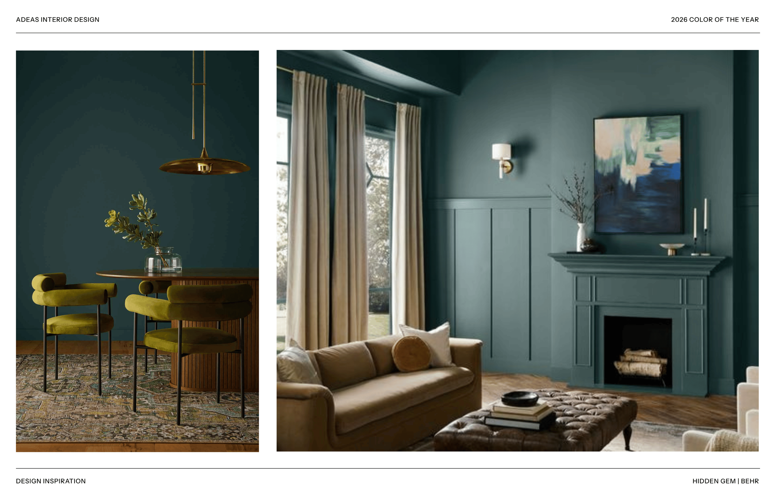
BEHR Hidden Gem
A muted, dusty sage that sits comfortably in the middle of the market. It is neither bold nor neutral, a transitional color for homeowners moving toward color without committing to it. Behr consistently reads to a broad-market audience, and this selection reflects that: approachable, pleasant, and unlikely to polarize. In a luxury residential context, it can work well in secondary spaces.
Use it for: Guest rooms, nurseries, laundry rooms, and secondary bath applications where a soft, livable tone is appropriate without demanding design attention.
Skip it if: You want a primary space statement. Hidden Gem is a supporting character, not the lead.

CLARK & KENSINGTON Hazelnut Crunch
A warm, toasted hazel-brown that reads as both earthy and sophisticated. This is the caramel-adjacent tone showing up everywhere in the market right now, in upholstery, cabinetry, and wallpaper, translated into paint form. It is a genuinely beautiful color with excellent versatility across lighting conditions. In a well-considered palette, it functions as both a neutral and a warm statement.
Use it for: Living rooms, family rooms, primary suites, and hallways where warmth and continuity are the goal. Pairs exceptionally well with natural stone, dark wood floors, and cream or ivory textiles.
Skip it if: Your space receives predominantly cool or north-facing light, this color needs warmth to come alive.
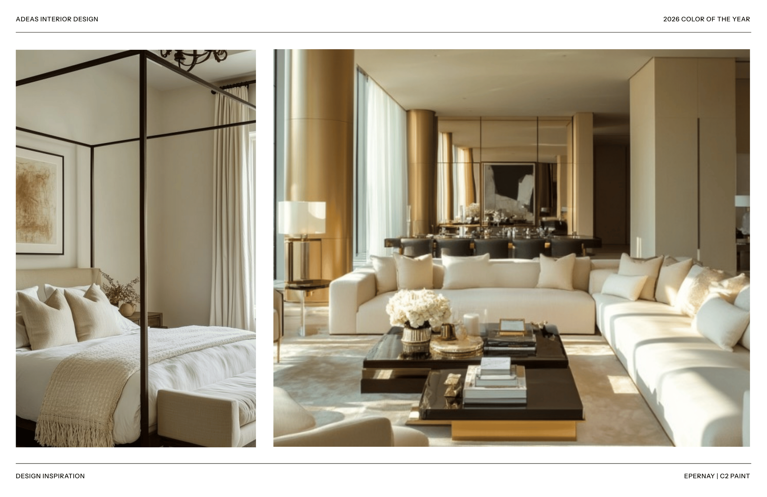
C2 PAINT Epernay
Named for the champagne-producing region of France, Epernay is a refined, slightly golden cream, closer to warm ivory than true beige. C2 is a designer-facing brand that consistently makes thoughtful selections, and this is no exception. It is a sophisticated neutral that carries warmth without weight, and it has the rare quality of looking genuinely different, and better, in natural versus artificial light.
Use it for: Formal living rooms, dining rooms, entry foyers, and any space where you want warmth and sophistication without color. This is the warm white elevated.
Skip it if: You want impact or statement. Epernay whispers beautifully, it does not command.

VALSPAR Warm Eucalyptus
A warm-toned sage, less green than the name implies, more of a soft, dusty herb tone. Valspar has been consistent in their green direction over the past few years, and this selection is a more approachable, residential expression of that commitment. It photographs beautifully and reads as fresh without being trendy.
Use it for: Bathrooms, laundry rooms, breakfast rooms, and home offices. Works well as a coordinating color in a larger palette built around warm neutrals.
Skip it if: You want your primary living spaces to feel enveloping and rich, this color is lighter and more airy than it suggests on screen.

DUTCH BOY Melodious Ivory
A warm, creamy ivory with yellow undertones, golden in some lights, soft linen in others. Dutch Boy has made a quietly excellent choice here: this is exactly the category of warm white that is replacing the cool, blue-based whites that dominated new construction for the past decade. It is approachable, enduring, and genuinely beautiful in a way that cool whites are not.
Use it for: Almost anywhere. Ceilings, trim, and full-room applications in spaces where warm neutrality is the goal. This is a foundational color that makes rooms feel complete rather than unfinished.
Skip it if: Your existing trim and millwork is a cooler white, mixing warm and cool whites reads as unintentional rather than designed.
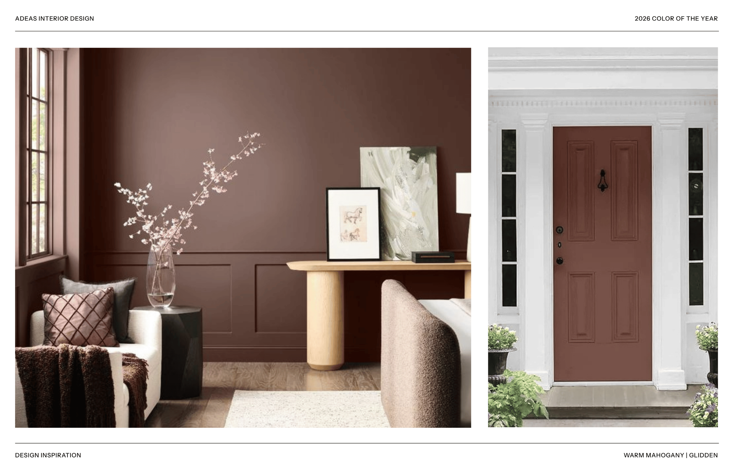
GLIDDEN Warm Mahogany
A deep, warm reddish-brown, the color of aged mahogany furniture, which is exactly what the name delivers. This is a bold choice from a broad-market brand, and it speaks to the same appetite for depth and richness that is showing up across the luxury design market. In the right application, it is remarkable. It requires commitment and confidence.
Use it for: Dining rooms, home libraries, wine cellars, home offices, and powder baths. This is a color for enclosed, intimate spaces where you want the room to wrap around you.
Skip it if: Open floor plans or spaces that need to feel light and airy. Warm Mahogany reduces visual space, use it intentionally in rooms where enclosure is an asset.

KRYLON Matte Coffee Bean
A deep, nearly-black espresso brown in matte finish, relevant primarily for furniture, cabinetry, and decorative applications rather than full-room wall color. The movement toward dark, matte furniture finishes is real and significant. Coffee bean tones on cabinetry, built-ins, and accent furniture create a sophistication and permanence that lighter options cannot match.
Use it for: Cabinetry refresh projects, accent furniture, millwork details, and built-in applications where you want warmth and depth without going all the way to black.
Skip it if: Full-room wall applications in spaces with limited natural light, this depth will absorb the room.

LITTLE GREENE Adventurer
A deep, regal and reassuring plum aubergine paint shade from our favorite paint and wallpaper companies. Little Greene consistently makes selections that feel design-forward without being inaccessible, and Adventurer is exactly that. It reads as moody and layered, with the depth and complexity of a color that rewards close attention. In the right light, particularly morning and evening natural light, it is breathtaking.
Use it for: Primary suites, home offices, and dining rooms for clients with the confidence to commit to a deeply chromatic space. Pairs beautifully with warm brass, sophisticated botanical wallpapers, and white oak.
Skip it if: You want a room to feel expansive or bright, this color commands attention and reduces visual space.
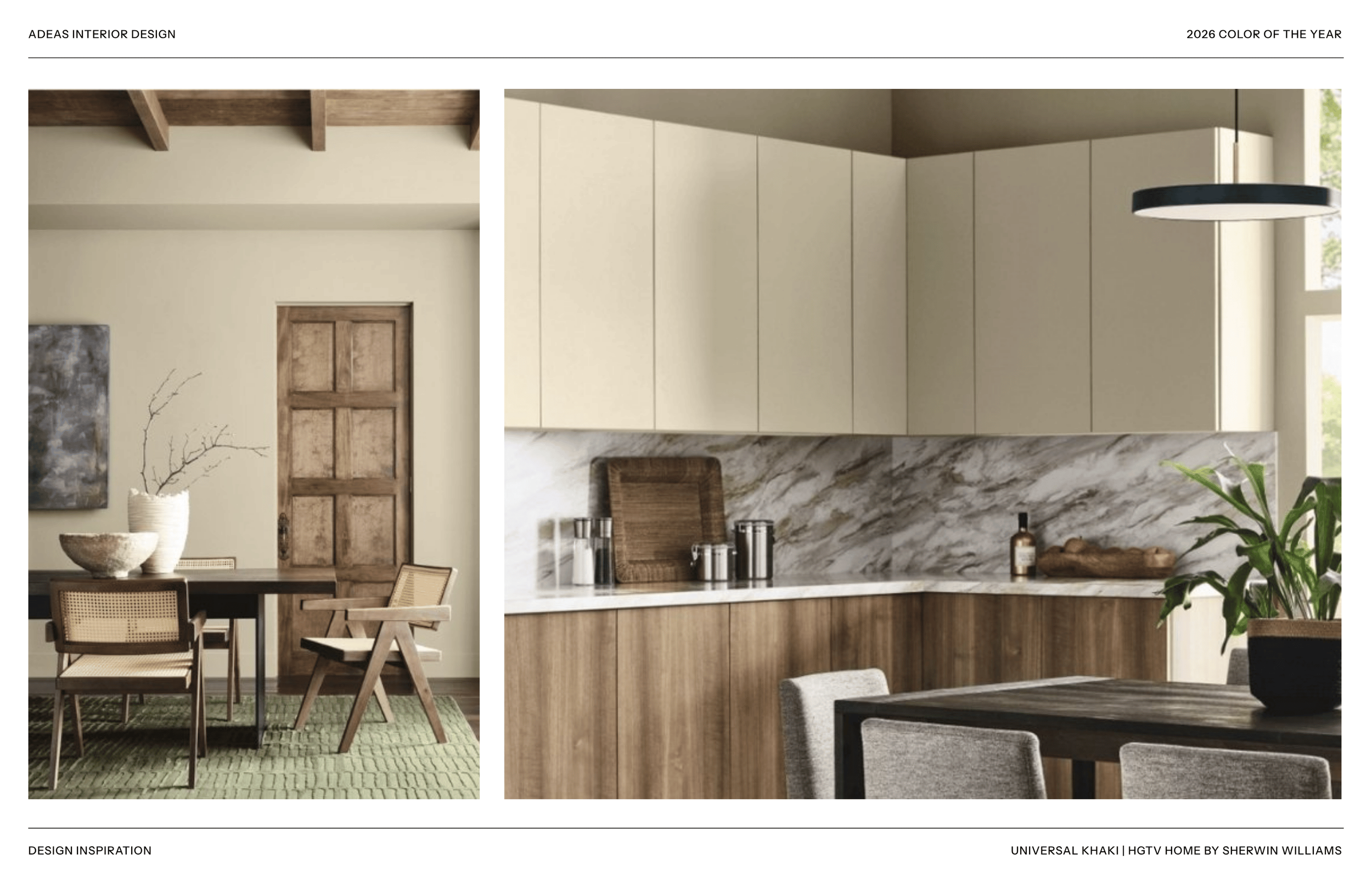
HGTV HOME BY SHERWIN-WILLIAMS Universal Khaki
A warm, mid-toned khaki that sits comfortably in the greige family, warm enough to avoid feeling cold, neutral enough to work with almost anything. This is the bread-and-butter of the broad residential market: approachable, versatile, and unlikely to read as a strong design statement. In a luxury context, it functions best as a transition color or in secondary spaces.
Use it for: Hallways, transition spaces, guest rooms, and secondary areas where continuity and calm are the priority.
Skip it if: You want your primary spaces to make a design impression, Universal Khaki is friendly but forgettable.

PANTONE Cloud Dancer
Pantone's softest selection in years, a warm, barely-there off-white with the faintest blush undertone. Pantone typically makes bold choices, so this feels like a deliberate message: the era of maximalism is giving way to something quieter and more considered. In design practice, Cloud Dancer functions beautifully as a backdrop that makes color-forward furnishings and art do more of the work.
Use it for: Galleries, art-focused spaces, and interiors where the design statement lives in furniture, textiles, and art rather than on the walls.
Skip it if: You want the walls to do the heavy lifting, this is the most recessive color on this list.

JAMES HARDIE Iron Gray
A cool, dark gray for exterior applications, relevant to clients undertaking new builds or exterior renovations. James Hardie's Color of the Year reflects their design-forward client base's appetite for modern, sophisticated exteriors. Iron Gray is a serious exterior color: strong, contemporary, and weather-resistant. It pairs beautifully with warm wood accents, black windows, and natural stone.
Use it for: Custom home exteriors, particularly contemporary and transitional architectural styles. Stunning paired with board-formed concrete, black window frames, and warm wood soffit details.
Skip it if: Traditional architectural styles, Iron Gray reads as contemporary and will fight against traditional detail profiles.
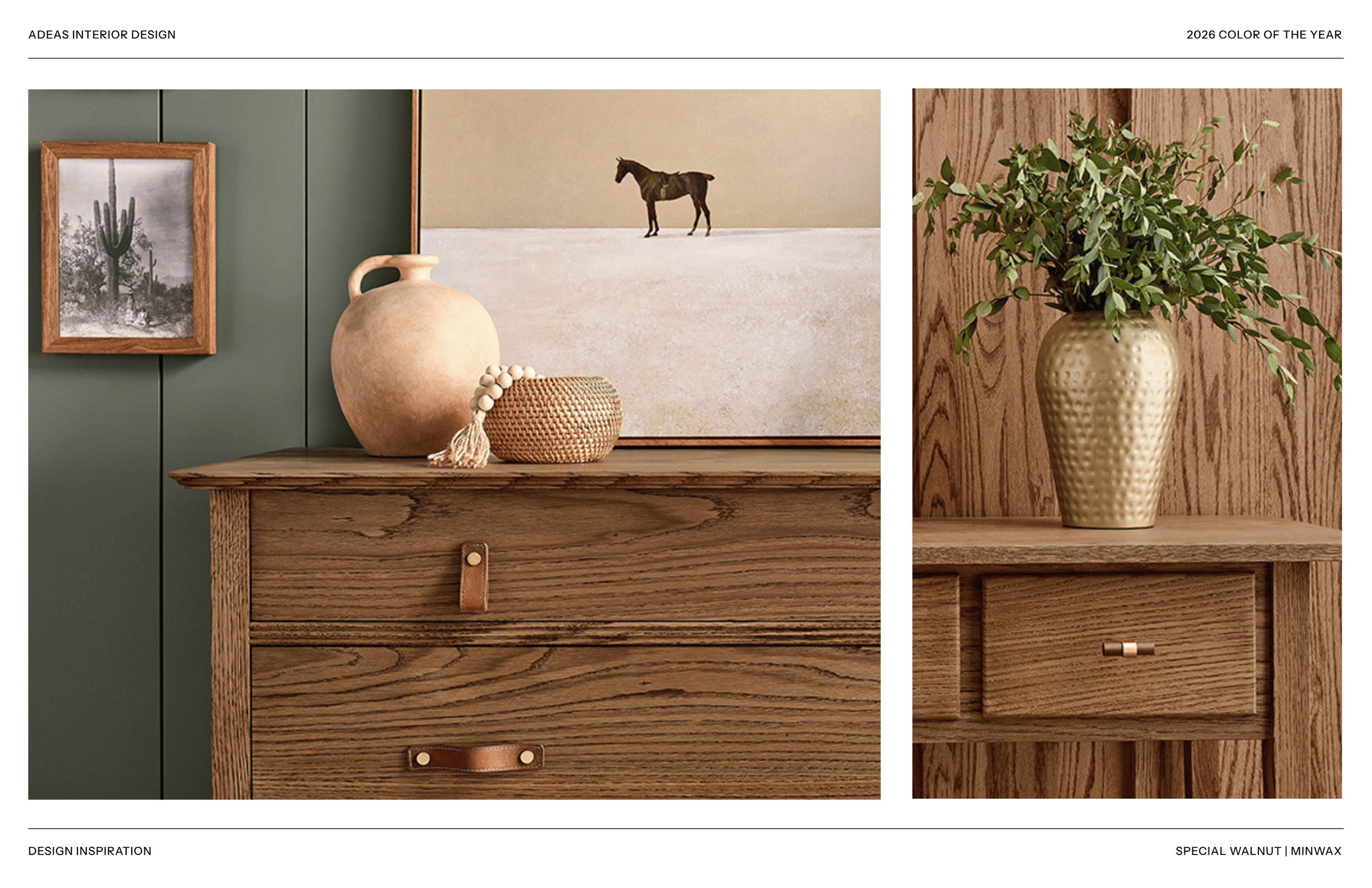
MINWAX Special Walnut
A warm, mid-toned walnut stain, relevant for our clients who are making flooring and millwork decisions alongside wall color choices. Special Walnut has been a top-selling Minwax stain for years because it reads as natural, warm, and timeless without the darkness of deeper stains. Its Color of the Year nod reflects the broad market's movement toward warm wood tones.
Use it for: Hardwood floors, custom millwork, built-in cabinetry, and wood furniture finishing projects where you want warmth and character without going too dark.
Skip it if: You want a dramatic, deep floor, Special Walnut is a classic mid-tone, not a statement.
HOW TO ACTUALLY USE THIS INFORMATION
Reading about colors is useful. Seeing them in your home is the only thing that matters. Here's how we translate the Color of the Year conversation into practical decisions for our clients:
The Sample Test Is Non-Negotiable
We will never allow a client to commit to a paint color based on a swatch card or a screen. Color shifts dramatically based on natural light direction, artificial light temperature, ceiling height, and adjacent materials. A color that looks warm and inviting in a south-facing showroom may read as muddy and gray in your north-facing bedroom.
Color reads differently at full scale. Always sample on your actual walls before committing.
Our process: large sample patches (at least 12x12 inches) applied to the actual wall in the actual room, observed at multiple times of day, in both natural and artificial light. Then we decide.
The Palette Is More Important Than the Color
No color lives in isolation. The most important question is not 'do I love this color?' but rather 'does this color work within the complete palette of this space?' The flooring, the millwork, the textiles, the metals, and the art all contribute to what the paint color looks like on the wall.
We design complete material palettes before any paint decision is finalized. The colors we select are always the last piece of the puzzle, not the first.
Enduring vs. Trending
Some colors on this list are enduring: Silhouette, Epernay, Melodious Ivory, Special Walnut. These will read as sophisticated in 2030 as they do today. Others are distinctly of the moment, and may date a space in ways that require repainting sooner than you expect.
Our recommendation: commit to trend colors in spaces where repainting is easy and low-stakes like powder baths, home offices, accent walls. In primary spaces (think: living rooms, dining rooms, primary suites) default to the enduring palette. Your home will thank you.
Trends tell you what the market wants right now. Great design tells you what your home needs for the next twenty years.
When to Call a Designer
Paint is the most reversible design decision in a home, and yet it is consistently the decision our clients feel most uncertain about. The reason is that color is contextual: it responds to everything around it, and predicting how it will behave in your specific space requires experience and a trained eye.
If you are undertaking a build, renovation, or full-home refresh and want a confident, cohesive color palette, one that works across every room, in every light condition, with every material in the home, this is exactly the kind of strategic guidance we provide. It is not a small part of what we do. It is one of the most impactful.
The Colors of the Year are a starting point for the conversation.
We'd love to continue it with you.
xo, Summer & Serena